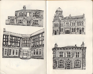
I have now completed all of the pub and bar illustrations for my zine!(Nov 1st)
Inside Covers
I decided to challenge myself and try to make a repeating pattern inside cover, as I am not extremely confident with pattern and it is something that interests me and that I'd like to use more frequently within my practice.
I started by drawing out four distinctive shaped beer glasses in the same technique that I had used to draw each pub/bar using black fineliner.
I thought the tile could repeat on a large scale four times across the landscape A4 page; so I used the dimensions of half the size of A5 to achieve this; (74x105mm)
(One tile on A5)
(Two tiles on A5)
However this didn't look as good as I thought it would.
I then tried a different approach;
Edit > Define Pattern > New Canvas (A4)> Fill > Pattern
I then zoomed in and cropped to the size that I wanted.
Back CoverI wanted the back cover to look pretty simple and professional with displaying my contact details. I decided to include an image from the repeating pattern, although I think this looks a lot better on a smaller scale.
Front Cover
The front cover is the one element that I am most apprehensive about; as the saying goes 'don't judge a book by its cover'; I want to aim to make an immediate positive first impression to anyone who picks up my zine.
Similar to my back cover, I'd like the front to look simple and effective; so I had a few ideas in relation to creating a custom pub sign entitled 'The Illustrated Otley Run'.
Images used for inspiration
I made up three different versions of a pub sign for my front cover; but I was unsure of which to use:
From the group 'critchen', the feedback I received said that the front cover looked rather plain. I thought that it might be a good idea to make the front cover look like the front of a pub, so I constructed a brick pattern and applied this to the cover.
At first I made an attempt to construct the front of a pub, but I thought even from the initial stages that it looked too fussy.
I much preferred focusing in on just the sign with the bricks.It looked more quaint and professional. All I have to do now is print the finished zines.


No comments:
Post a Comment