Monday 30 November 2015

Monthly Review: November

Where am I up to? Where do I stand?

I have decided that it might be a wise idea to do a monthly check in with myself, just to make sure that I still have my head screwed on and to establish where I stand within my practice. This will be a good way of keeping track of my current interests and to set individual goals to work towards.

How am I doing generally?

Honestly? I'm not in the best place at the minute. I'm not at all the type to share my problems with the whole world but its important for me to recognise how my current struggles with my mental health are effecting me as a person and my work. Having low motivation, energy and little interest in things I enjoy, importantly illustration, I think is really showing in my work, especially 504, which is frustrating because I am so desperate to do well and actually enjoy this project alongside the others too.

BUT I am very aware of this, and know the steps I need to take to feel better, everything is under control and I'm getting the support I need so there is nothing to worry about :) 

Who's work do I admire at the minute?

Following my recent visit to Thought Bubble I have become really interested in the work of Emily Rose Lambert (I bought her zine called Four Days in Budapest)

She graduated from Loughborough University in 2013 with a first class honours in Illustration, and is currently working on comics and narrative work, editorial/ book jackets and patterns. I really admire her versatility and hand crafted aesthetic she applies to her practice. It also gives me scope into things which I could potentially achieve after graduating!


What am I struggling with the most at the minute (work wise)?

I am having so many difficulties with 504! My work keeps going round and around in circles, and I have completely lost interest in the brief. I think not being used to having such a long deadline has really thrown me off key, as last year was more fast paced with quick idea and process generation. But I need to keep going because I can see so many good potential things that will come out of this brief, its just the process of finding what those are thats the trouble.

Due to my 504 problems, I am finding it difficult to get started on my Responsive projects due to struggling with time. This has reinforced the importance of keeping on top of work to not completely nose dive in every module. However I have established some briefs that I am interested in, which include the Penguin Random House Design Award, and the Royal Watercolour Society, and am looking forward to tackling those.

COP and PPP are dwindling on the back burner ever so slightly, but there are no near deadlines for them as of now so they aren't priority.

Plan of action

(between now and next month)

  • Take it easy and don't overwork myself, have a rest over Christmas and don't put too much pressure on myself to complete work
  • Keep chipping away at 504, an idea is sure to come!
  • Try and work backwards from deadlines, then I will gain a better sense of when I need to do things in time so that I am not in a mad panic/rushing my work in time to complete it


Life's a Pitch: Session Three

Before the start of the session, my group and I had a catch up as to where we are all at in terms of the brief. We had each done some research into competitors and had a think about where we are all generally up to in terms of planning, this was all re-iterated in the group session. We have decided to have a half an hour meeting once a week, and we have also set up a Facebook group to discuss progress outside of taught sessions.


Task One: Business Concept(personal)

What is your business idea?

'Visuwallise'; a creative service offering the rejuvenation of interior and exterior spaces with bespoke murals.

How did you come up with it?

We all discussed our strengths and weaknesses-played to our strengths in terms of existing skills and thought of a potential gap in the market.

What excites you about it?

Working together to visually transform spaces, meeting and working with clients and seeing my work on a large scale, potentially in public places.

What industry does it belong to?

Service/creative

What improved features/services do you provide? something new? something better?

Rather than just ordering a photographic mural from the internet, we visit the space and craft the final outcome by hand to a high standard to meet the customers needs.

What is your market- who are your potential customers?

The market is wide; people of any age wanting something more visually exciting for their home or business.

Which companies or types of companies do you think of as potential competition?

Freelancers that are well known in the area, online companies such as wall sauce.com, artists  who provide similar services  e.g. bespoke murals.com

Task Two: Business Concept (global)

This was a little harder because we had to discuss our individual thoughts within the group and agree on the most appropriate language to appeal to our market.

What is your business idea?

An illustration collective specialising in the rejuvenation of interior and exterior spaces.

Trying to stay away from the word 'mural' because it is too generic...

How did you come up with it?

Celebrating our differences to identify a gap in the market.

What excites you about it?

Freedom; the fact that we are not restricted with ideas, method and process. Also, seeing individual work on a large scale being exposed to a wide audience.

What improved features/services do you provide? something new? something better?

We aren't just a mural service- our ideas are more edgy. We can cater for a multitude of audiences. 
There isn't an active group doing it already.
We are all specialised illustrators, no job is too big or too small.

What is your market?

Established businesses, events and brands (we want to target these first) and when we are more established we can focus on expanding into a home service.

Which companies or types of companies do you think of as potential competition?

Illustration agencies, online mural companies, freelancers.


Task Three: Business Manifesto (personal)

Core business concept

Creatively rejuvenating interior and exterior spaces through illustrative processes.

Core business values

To provide a high quality, hand crafted and bespoke service to meet and satisfy the needs of our customers.

Core business goals

To visually enhance spaces that visually impact on and improve personal and public places.

Core financial goals

To be financially stable enough to produce the highest quality service possible, and pricing competitively and sensibly enough to cover our costs.

Task Four: Business Manifesto (global)

Visuwallise this, a collective specialising in rejuvenating interior and exterior spaces. A dependable, creative service providing unconventional solutions to like minded businesses, events and initiatives.


Today's conclusions

The discussions today have been extremely productive in terms of establishing what we want to offer as a business, what we stand for and who we will provide for. The statements we have written are only first drafts, yet are strong foundations which will develop over the course of the remaining time on the project in correlation with the research and knowledge that we will build.
It was sometimes challenging to bring our ideas together and agree on statements as a group, as we all have different levels of knowledge and interests surrounding our business idea. I found it most difficult to use the correct language in particular proposals, especially the manifesto as our market research is only basic at this stage. Also, the market for creative rejuvenation/mural constructing is extremely wide, and with wanting to offer bespoke services it is difficult to try and sell this as a whole to our audience as each customer will want to gain something unique and individual from us.

Productivity plan

We plan to meet weekly instead of relying on the timetabled fortnightly session, just so that we have less of a long winded time in-between each meeting allowing us to keep on the ball and current with out productivity and progress.

For next Monday, 7th December:

  • Come up with five thumbnail sketches for a logo idea
  • Figure out our own individual contributions to the business in terms of creative practice; which methods of illustration will we use to transform the spaces we are given; how much would this cost?
  • Pick a client that we could see ourselves working for: produce a mock up of an interior space in the dimensions of 5x2
  • Research the cost of renting a studio space and the units within

Sunday 29 November 2015

Life's a Pitch: Market Research

'Visuwallise' aims to 'rejuvenate spaces with diverse approaches', in other words, create bespoke murals for places and spaces.

Competitors:


Wallsauce.com 

'stunning made to measure feature wall murals'

Principle: Regular/self adhesive photographic murals to be printed to bespoke dimensions and delivered for self installation. Choose from a range of photographs, or upload your own.

Price: from £26 per square metre, delivery is free in the UK and mainland US.


Muralsyourway.com 

Principle: Murals your way have a collaboration of artists available to choose artwork from, as well asthree main customer categories:
  • Home: gives you the option of material choices, also has an idea book available to help choose the best option. It also has the option to sign up to the newsletter to keep up with upcoming trends. 
  • Business: As well as material choices and idea book availability there is the option to view case studies of businesses that have used murals your way to visually enhance their spaces. 
  • Designer: giving the eligibility to sign up as a designer and order samples, save and track images, samples, projects, and orders, checkout with designer pricing, and store  designer information.
I couldn't find any information on pricing, but I imagine that it will be a similar process of cost per square meter.

Bespokemurals.com

Oxana Syntik is a freelance mural artist who has a relatively large portfolio of murals in public places, in a range of different styles such as classic, modern and childrens.


This is the most similar of the businesses that I have looked at in comparison to ours. Unfortunately the pricing information is rather vague due to time scale and skill used.

From having a look into other existing businesses that offer similar services to which Visuawallise aim to has given me an insight into processes and setups that we could potentially use, for example pricing per square meter and charging hourly rates etc.

Next steps:

In the next meeting we will finalise how much we wish to charge per square meter, but prior to that we will need to discuss the sourcing of materials and funding to buy these before any prices are fixed. Also we will need to figure out if we will need to take into consideration any premises that we may need to rent as a studio space, and things such as as logos and advertising methods too.

Friday 27 November 2015

Joan Cornellà

Whilst having a tour of the Colours May Vary exhibition space for our launch in February, we had the opportunity to look at Joan Cornellà's latest exhibition entitled Contains Adult Themes.


The work on display was an array of Cornellà's black comical and surrealist humour comic strips and art work. 

I found his work so disgustingly hilarious, his crazy imagination is somehow charming through the use of bright colours and clever correlation with sarcasm. I really admire how gutsy and bold he is, with his illustrations intending to make you laugh out loud yet make you feel uneasy at the same time.


His use of sequential imagery is really relatable to how we react to things in real life, you almost feel like you're having a sort of conversation with the picture itself or being involved in some way. I definitely think that you have to have an open mind and not be easily offended to appreciate this fantastically clever series of prints. Cornellà has executed his target audience in a very outgoing way, by pushing all of the boundaries of sensitive subjects and adding a light-hearted feel to them.


Cornellà's work has sparked my interest for sequential imagery just that little bit more, and opened my eyes to the extremes in which humour can be used in illustration. Humour is a theme that I would like to emphasise more in my practice, so that an audience can relate to it better and make them feel more engaged with the images and the meaning behind them.

Wednesday 18 November 2015

Fortnightly 'Critchen'

Today's Queries

  • Need feedback on ideas for prints and how I can develop them (504)
  • Feedback on sting ideas (504)
  • Could I realistically complete a responsive brief for Monday?? (503)
Most of the feedback required today was for OUIL504 the authors brief; as I have struggled immensely in productivity in the past few weeks with the exception of the past two days where I have generated a few potential ideas.

Housemates' Feedback
  • The side profile ideas are good, but they seem a bit too literal, especially the prosopagnosia idea. I could develop different metaphors as an advancement from the first idea by pushing it further.
  • I could explore the more scientific ideas of the conditions?
  • I could try and do prosopagnosia for the animation instead, but not for the print?
  • Another idea for the animation could be to split the face into three and create a flip book?
  • Any three print methods would be effective, try and use hand rendered techniques?
  • With the responsive brief; probably unrealistic. Might be a good idea to timetable in specific times to focus on that module.
Things I will take forward from here/reflection
  • I will spend the next couple of days focusing my time on refining my ideas for OUIL504, as I need to be certain on what I am doing in the project proposal form for Tuesday.
  • Either work on prosopagnosia or look into an alternative condition to illustrate if I am struggling to make it less literal
  • The responsive brief due for Monday probably won't happen :/ find another one that I can sink my teeth into, and timetable myself in properly.

Monday 16 November 2015

Life's a Pitch: SessionTwo

The first task we had to do today was discuss the initial ideas we had a fortnight ago and refresh our minds about where we are going with the business plan.

We then had to talk about ourselves on an individual basis, identify  strengths and weaknesses about each other; this is what George wrote about me:

  • Playful artwork
  • Organised
  • On time
  • Good typer
  • Good analyst 
  • Business Skills 
  • Talking and presentation skills
  • My dad has decorating tools..haha
  • Procrastinating!
  • Concentration lapse
More discussion notes


Tom also came up with the first draft of a business proposal whilst we had the two week gap.


Our final task was to come up with a haiku to pitch our business idea to the rest of the class


Outcomes of today

I feel much more confident and and positive about the business proposal after todays session. We are all becoming more friendly as a group and seeing eye to eye more, which has resulted in more ideas being generated and setting realistic goals.

After each session we as a group have set each other a task, and this week we have to research the market, our competitors and find examples of the services we would like to offer that already exist.

Thought bubble

Yesterday I went to check out the thought bubble comic convention, I would't usually attend an event like this but I thought it would be something a different and interesting.


As I said, I'm not a massive hardcore comic book nerd myself so I mainly looked at things that would appeal to me, and that I could see myself producing. These included postcards, greetings cards, images printed onto products such as phone cases and stickers, and also zines and books. It was very inspiring to see these products being sold at a well known organisation; it's given me some inspiration and something to aspire towards.


I especially loved these screen printed children books. I noticed that with conventions like these that there is sometimes a niched market stereotype of 'comic book nerds' like I even said myself. But it was great how there were products like these to appeal to younger audiences too.

Here was the BA Illustration zine table!! (Sophie and Joe were camera shy)


It was great to see a huge range of zines on display reflecting all of the hard work that had gone into producing them. 

I also had some good feedback, somebody bought my zine and wrote a post on instagram about it! YAY! 


My haul


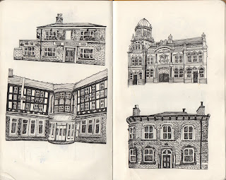
I didn't have a massive budget but I managed to come away with some great postcards, stickers and zines. My favourites were 'four days in Budapest' by Emily Rose; I loved the red and blue colour scheme and how the zine documents her findings in a new surrounding in a reportage kind of style. I also loved the ABC of buildings, as I am really enjoying taking in and recording architecture myself at the moment, I am kicking myself because I didn't take down the name of the illustrator!!

Reflection

Thought Bubble was a great way to open to my eyes in a direction that I could potentially take my practice, as well as informing myself about the world of comics and narrative imagery. There is a huge market and demand for these kinds of products out there, as well as things and ways of working that I have already started to develop.

Talking to illustrators and artists on the stands about their lives and individual practices has given me a sense of reality too, and some of them gave me some good advice in terms of finding myself within illustration (mainly just to stop being so uptight and relax and enjoy the process more!).

I'm just thinking that in a years time, that could possibly be me on a stand selling products and publications that I have produced. It is a massive step for me but who knows how far I will come in a year!

Monday 9 November 2015

Sectors and Services

Task: find five examples of professional practice (from study task two) and explain how they relate to  the creative industries.


Example 1


Which industry sector(s) has the work been produced for?
Secondary, tertiary, private

Which services does the work relate to? 
Design and fashion, advertising, wholesale and retail trade

Is it successful?
Yes, in terms of the secondary sector, the cardboard packaging is simplistic, therefore relatively cheap to produce, resulting in higher turnover. From the tertiary and private sector's perspective, the simple monochrome designs made by simple mark making with bold yet delicate hand rendered text are appealing to teenagers and young women associated with the popular Topshop brand. The distinctive packaging raises its profile alongside the desire to buy and use the product.


Example 2


Which sector has the work been produced for?
Primary, Tertiary, Public and Private sector

Which services does the work relate to?
Health and social work, hotels and restaurants, business services

Is it successful?
This image is highly successful because it communicates to a wide number of sectors raising concerns over the rising obesity epidemic in connection with the food industry. It communicates to farmers in the primary sector, where the food is harvested from, informing them of how their sources are being manipulated. It communicates to the tertiary sector, for all of the restaurants where employees are selling foods that are high in fat and other chemicals that are detrimental to our health. It communicates to the government, and companies such as the NHS who are having to spend large amounts of money treating illnesses associated with obesity, and us, the consumers, portraying the message 'you are what you eat'; with words to that effect informing us that if we eat too many bad foods, our health and wellbeing will deteriorate too as a result of that.

Example 3


Which sector has the work been produced for?
Tertiary, Quaternary 

Which services does the work relate to?
Education, Health and Social work, third party organisation

Is it successful?
The image relates to the 'Change 4 life' scheme, which encourages people to cut unhealthy habits and make positive changes to lifestyle factors concerned with diet and exercise so that overall health will improve. The image alone does not communicate everything that Change 4 life has to offer, but the brightly coloured figures shown engaging in exercise are appealing to all generations, especially the younger generation in an educational sense. The main aim is informing people how important is to have a balanced life style.

Example 4


Which sector has the work been produced for?
Tertiary, Private

Which services does the work relate to?
Advertising, wholesale and retail trade

Is it successful?
This form of cereal packaging is heavily involved with creative process, and would probably appeal to a more affluent market, being priced slightly higher than generic cereals due to the level of craft that has gone into designing and advertising the product.


Example 5


Which sector has the work been produced for?
Tertiary, Quaternary, Private

Which services does the work relate to?
Creative industries, wholesale and retail trade

Is it successful?
The product is successful in the high demand of the adult colouring book fad. It is cleverly marketed, suggesting that taking time out to colour in is extremely therapeutic and will relive stress in todays high-pressure society, simultaneously encouraging potential buyers to engage more with creativity.


Reflection

I have found this task challenging yet informative. It was sometimes difficult to distinguish how to categorise each service and sector, but it did help me gain a better understanding as to how products can benefit both consumers and employers who are associated with particular services and sectors. In terms of my own practice, this will increase my knowledge of who my target markets may be, and how I can use my creative skills and product knowledge to appeal to both larger and niche markets, communicating in the clearest and most visually engaging ways possible.

Life's a Pitch: Session One


Task 1:

In groups, make a list of jobs that an Illustrator can do :


We discovered that illustrators are pretty adaptable, although when we talk about illustration in the creative industry, it sadly doesn't exist. BUT, as we are adaptable, it exists in ALL of the disciplines.

'Life's a Pitch' Brief

In groups we have to come up with a business proposal and deliver it as a presentation. We have to think of ourselves as creative practitioners in this instance, not illustrators.

Task 2:

Come up with a list of questions about the brief:

  • Is it an actual business that we have to set up? Or a sort of collaboration organisation like no brow?
  • Are we going to be finding a problem to solve, or are we going to be given a problem to solve?
  • What about budgets?
  • Are we going to learn about everything legal? or do we have to figure it out for ourselves?

Answers:

  • It can be either!
  • We have to go out and find the problem; a solution to a need (gap in the market) we also need to generate work to present, but don't necessarily need to make a product
  • Budgets are whatever we need, but we need to go figure about where this money is going to come from
  • We will learn about these adult responsibilities.
Task 3:

In 10 minutes, try to come up with an idea for a business plan...


We came up with a proposal to set up an agency to create bespoke murals for events and personal use.
Collectively we decided that this proposal may have potential in the following areas: 
  • Thought that there might be a potential gap in the market for this kind of illustration
  • There are plenty of events opportunities constantly arising in Leeds
  • As the mission statement is relatively open, the opportunity is given to each of us to play to our strengths within the areas of illustration that we are familiar with and enjoy doing.


Finished Zines

I had SO many problems trying to print my zines. The first problem that I encountered was that the printer in the Illustration studio kept printing my work out at a really low quality for some reason. 

I then tried to print my zines on a different printer, the level of quality was much better so I decided to go for it and print out five. Although when I'd looked at them for a while, I decided that I didn't think that the white border around the edge looked very professional, and that it might be a better idea to try and print the cover full bleed.


However this meant that I would somehow have to alter the proportions of some of the pages if the pattern on the inside covers were to align correctly, and also print on A3 paper.

The steps I had to follow were:

Print booklet > print settings > page setup > (change paper orientation)

Setup > page position > centred (A3) > crop marks

Scale to fit

Printer > short edge binding

After a lot of trial and error trying to print out correctly, I finally had five copies of my 'The Illustrated Otley Run' zine, hooray!


Reflection

I'm really pleased with the outcome of my zine, and I'm definitely glad that I didn't just leave them as they are when I was unsatisfied with the bleed of the border.

Producing the zines took a lot longer than I'd estimated, due to the level of care and attention to detail required when gingerly illustrating each pub/bar, although this has benefited the overall visual quality and aesthetic of the zine.

If I were able to have more time, I would have definitely considered producing a special edition of the zine; an activity version in which people could have taken along on the Otley Run and scored points for each pub they visited/ how many drinks they had etc. Although I am very pleased with the simple versions that I have already produced. I'm hoping that they will appear to a wide audience when they eventually go on sale at thought bubble festival, to residents of Leeds and to students as well.


Thursday 5 November 2015

Fortnightly 'Critchen'

My housemates and I decided to name our group crib's 'Critchen' sessions, as the crib's take part in our kitchen.

These will take place every other Wednesday. I find these really useful so far because we all know where we are all at in our own projects; whereas sometimes with group crib's in class, we haven't seen different peoples work before, and it is more difficult to give suggestions as to where to go with their project because we have only just seen what they have been building up to there and then.

My Queries
  • I feel like I keep getting mixed messages from the tutors and people in our class, for example does our animation have to be two colours as well? (504)
  • I'm not sure on what to do for my animation (504) 
  • Does any competition count for responsive? Could it count for PPP as well? (503/502)
  • I'm not too sure on my essay title and where I am going for the whole of COP (501)
  • Need some feedback on my zine cover, does it look too plain? (502)
Housemates Feedback
  • Apparently, the animations and prints have to link and both be two colours...try greyscale with the brusho prints I have produced; or use photoshop to pick out two colours.
  • For the animation you could try the LSD things? Try and find some music that associated with that kind of thing.
  • We are unsure about that too, so we will ask the tutors which applies for PPP and which applies for Responsive.
  • With the COP essay; what do you want to focus on more? Is it the public's opinion of obese people? (this way you might not get that many references in) or The NHS's view; and how they could spend money elsewhere??
  • Zine cover does look a bit too plain. You could make the front cover look like the front of an actual pub? For example put bricks, doors, roof tiles and gutters on!
Things I will take forward from here/reflection
  • I definitely feel more confident at where I am with all of the projects, I have definitely progressed and become more focused since the last Critchen.
  • I clarify and ask the tutors about the things I am unsure about in terms of project briefs.
  • DO MY ZINE ASAP!
  • Dedicate a good evening to COP; I feel like I have been neglecting it somewhat. In this time, properly research into my essay question; what is it that I ACTUALLY want to find out?

Tuesday 3 November 2015

Zine: Inside and Outside Covers

I have now completed all of the pub and bar illustrations for my zine!(Nov 1st)


Inside Covers

I decided to challenge myself and try to make a repeating pattern inside cover, as I am not extremely confident with pattern and it is something that interests me and that I'd like to use more frequently within my practice.


I started by drawing out four distinctive shaped beer glasses in the same technique that I had used to draw each pub/bar using black fineliner.


I thought the tile could repeat on a large scale four times across the landscape A4 page; so I used the dimensions of half the size of A5 to achieve this; (74x105mm)

(One tile on A5)


(Two tiles on A5)

However this didn't look as good as I thought it would.

I then tried a different approach;

Edit > Define Pattern > New Canvas (A4)> Fill > Pattern


I then zoomed in and cropped to the size that I wanted.
Back Cover

I wanted the back cover to look pretty simple and professional with displaying my contact details. I decided to include an image from the repeating pattern, although I think this looks a lot better on a smaller scale.

Front Cover

The front cover is the one element that I am most apprehensive about; as the saying goes 'don't judge a book by its cover'; I want to aim to make an immediate positive first impression to anyone who picks up my zine.

Similar to my back cover, I'd like the front to look simple and effective; so I had a few ideas in relation to creating a custom pub sign entitled 'The Illustrated Otley Run'.


Images used for inspiration


I made up three different versions of a pub sign for my front cover; but I was unsure of which to use:


From the group 'critchen', the feedback I received said that the front cover looked rather plain. I thought that it might be a good idea to make the front cover look like the front of a pub, so I constructed a brick pattern and applied this to the cover.

At first I made an attempt to construct the front of a pub, but I thought even from the initial stages that it looked too fussy.


I much preferred focusing in on just the sign with the bricks.It looked more quaint and professional. All I have to do now is print the finished zines.