Tuesday 23 December 2014

What is Illustration- Part 2

Research into professional practice is extremely important to every illustrator in able to develop individual practice, knowledge and the ability to distinguish between drawing, image making and illustration itself.


This diagram shows a generalisation as to how we process research. 

Assimilation is a way to associate things with the problem, General Study is the breadth of possible solutions to the problem, Development refines the decisions made and focuses down again, and Communication is sharing the solution with others.

There are three main approaches to the generation and investigation of ideas:

Stimulated approach- A conscious or sub conscious search for inspiration from an external source.

Systematic approach- Acting according to a plan and experimentation

Intuitive approach- Based on prior knowledge and experience.

Where is Illustration?

In groups of five we discussed our five chosen images from each pinterest board, and how they related and represented each category, and had to reflect upon this task.

Five reasons why it was a useful task


  • Distinguishing WHY we like or are interested in something
  • The discovery of Pinterest- a whole hub of inspiring images from a wide scale and personal perspective as to what interests individuals 
  • Categorising our own interests/areas
  • Seeing the illustrators individual focus in each piece
  • Informative process, allowing us to make future references and links
Five ways to extend research
  • Discuss with peers
  • Make more boards with different categories
  • Look into the approaches and process the artists take within their work
  • Research into external influences of the era that could have informed their work
  • Look at other things relating to the original piece
We learned that the whereabouts of illustration exist under four categories: Products, Place, Publications and Online.

Task

Part One: Discuss a useful illustration website
I found the AOI (association of illustrators) website extremely informative at a first glance, although the homepage didn’t initially entice me with the dull grey colour scheme, but the easily accessible navigation allowed me to find a variety of interesting areas. The homepage states the mission statement of the AOI, of how it aims to ‘protect illustrators rights and encourage professional standards’, which immediately sets a bar of high standards and creates a sense of trust and security due to the website being legitimate. 


I was drawn to the websites blog and its informative content including in depth and analytical illustrated book reviews, exhibition reviews, illustrated magazine reviews etc. as it is useful to read a critique from a professionals perspective. Looking at this blog has and will continue to keep me on my toes and read about current and interesting aspects of illustration.


The artists portfolio section of the  AOI website was extremely helpful in finding out how illustrators choose and arrange the high standard of their work to present. The awards and events sections are also kept extremely current on opportunities for illustrators and exhibitions that we can attend to inform our practice and develop our own interests.

Part Two: List 10 'types' for each category

Product:

  • Merchandise
  • Clothing e.g. t-shirts
  • Stationery
  • Packaging
  • Prints
  • Greetings Cards
  • 3-D Illustrations
  • Jewellery
  • Accessories
  • Tarot Cards


Publication:

  • Instruction manuals
  • Textbooks
  • Children's Books
  • Zines
  • Fashion Magazines
  • Graphic Novels
  • Editorial
  • Comic Books
  • Book Jackets
  • Picture books
  • Posters


Place:

  • Billboards
  • Galleries
  • Exhibition Spaces
  • Open space (3D illustration)
  • Hospitals
  • Schools
  • Print shops
  • Restaurant
  • Peoples homes
  • Workplace


Online:

  • Mobile/tablet apps
  • Pinterest
  • Google homepage
  • Video games
  • Online advertisements
  • Newspaper/magazine's web sites
  • Web design
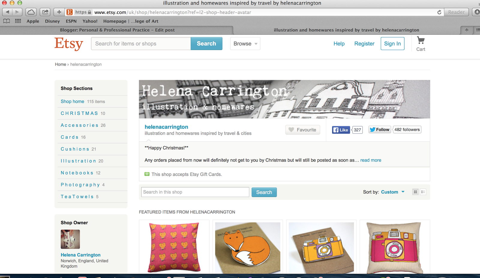
  • Online Shops selling artwork e.g. Etsy
  • Specific Illustration websites
  • Practitioners websites


Part Three: Five types from each of the four categories

Product


Publication


Place


Online


Part Four: Choose 1 example from each category and explain why it is relevant to your creative interests


Product

I am really interested in the connection between illustration and packaging design. The customers reaction to become attracted to a product and be persuaded to make a purchase largely depends upon the quality of design of the packaging. The style of illustration, type and colour scheme can also have an affect on the target audience of the product.

Place

I believe it is really important to gain subjective accuracy within illustrations commissioned for hospital wards. The mission statement of hospitals 'to make patients feel comfortable' is often overseen due to the pain and suffering of patients. Therefore the illustrations painted or framed within wards are required to refresh the minds of patients and make them feel peaceful and less stressed.

Publication

Illustrated posters used for advertising purposes have a similar principle to products. Every element included within that poster will apply to a specific target audience, whom will make a pre-judgement of what they might think the event will be like by simply taking a glance at the poster.

Online

The novelty 'google doodles' really appeal to me in a light-hearted sense. I am interested in the way that the illustrators use image as type in creating a popular focal point for the worldwide most popular search engine, which is an extremely large audience. They are informative, for example illustrating anniversaries of particular events in history, or current events e.g. holidays such as Christmas, Easter etc.


Friday 19 December 2014

'Nuggets'- Andreas Hykade

I came across this animation entitled 'Nuggets' whilst browsing through Buzz Feed. Without using words, it accurately captures what it is like to be an addict. It is described as a 'Perfect visual metaphor for chemical dependance'.

In order for the audience to have a higher focus on the subject matter, the visuals are kept extremely simple by using a limited colour palette of black, white and various shades of yellow. 

(the text featured in the images are annotations of sequences from Buzzfeed)


The piece is extremely moving. It illustrates the intricate frustrations with highs and lows of addiction through simple eyes, which is both informative and realistic for the audience.


Tuesday 16 December 2014

Jean Jullien

I came across this illustration by Jean Jullien on pinterest, unfortunately the title is unknown.

The message of the illustration ties perfectly in with the theme of my COP essay, which is that technology is taking over our lives and social media is brainwashing us into becoming more self-centred and less in touch with the real world.

The image shows an unsatisfied couple spending 'time' together with each normal mannerism or action being substituted by a social media app. It demonstrates how society has become somewhat unsociable by using social media apps, and how we are being driven away from spending quality time with each other because we are too concerned with what is going on in the virtual world.

Friday 12 December 2014

Andrew James Jones- 'How long have I been dead?'


I picked up this A6 book from the library being interested by the title on the spine, 'how long have I been dead?'. I was curious about the contents of the book, but I was quite surprised when I looked inside. It is honestly the weirdest/most trippy book I've ever looked at! 

There wasn't a great deal of information available online with regards to the illustrator, Andrew James Jones, however I did find a statement saying that some of these illustrations featured in an exhibition in London in 2007. The caption stated 'The work represents an ongoing investigation into the notion of contemporary grotesque. Clashing the disparate concepts of the object and the humour into a single contained image in an attempt to activate a fluctuating unresolved response within the audience'

A 'fluctuating unresolved response' was the exact response that I had. The illustrations are so bizarre and surreal that I could not make sense of what was going on, or what the message was trying to say. However I commend Jones for his portrayal of his vast and obscure imagination through his disturbing fictional characters and their actions.

Tuesday 9 December 2014

Jessica Hogarth

I first discovered Jessica Hogarth's work in a shop window on my visit to Whitby on Friday; I was attracted by her delicate use of line, muted colour palette and subject matter revolving around places.


Reading into her website, I found out that Hogarth is a LCA graduate! Since graduating in 2010 from the Surface Pattern degree her career took off immediately; exhibiting in London at the New Designers exhibition, being offered an in-house position at a company in Manchester to working in her own studio space in Whitby today.

I am interested in the way that Hogarth takes inspiration from her surroundings which reflect in her work. She takes regular primary research trips around the UK and Europe to gather information and experience for her work. 


One of her stronger influences is the Yorkshire Coast, applying a nautical theme as well as focusing in on the intricacy of traditional buildings. I'm inspired by the way that she has successfully applied her designs to different media e.g. wallpaper and phone cases as well as simple prints.


Hogarth has inspired me to explore more and take in my surroundings by carrying out observational drawings, as they could potentially become successful!

Thursday 4 December 2014

Drew Millward

Today, artist Drew Millward came in to give us a talk on his profession. His work is extremely intricate and expressive, crafted in the 'old fashioned way' drawing using pens and pencils; although over time he has used digital processes to enhance the quality and process of his work. 

Some examples of his work:


Millward started by saying that the things we look at when we are young are the most important. Pictures can be extremely powerful through story telling, and those images often stay with us for a long time. Some of Millward's favourite childhood illustrators include Jan Pienkowski, Maurice Sendak, and Richard Scarry.


Growing up, Millward loved music and as a teenager him and his band played at local gigs in and around Bolton. He attended Leeds Metropolitan/Beckett university at 18 and studied fine art, although throughout he was more interested in Graphic Design and felt like he never fitted in.

Later on, Millward became very interested in gig posters. The poster by Jay Ryan entitled 'squirrels taking risks' opened up his eyes to opportunities in creating posters, and at this point his work really kicked off as we was extremely lucky to become involved with the right people at the right time.


Simultaneously, his work also kicked off with screen printing as he was able to make and sell more physical products at the same time as working with bands and promoters. He said that if you have an interest in something you enjoy, make it pay for itself!

As his work began to further develop, he acquired a more professional process of working. This consisted of drawing in pencil, scanning it in and tracing it in photoshop and then screen printing. Millward became accustom to working in a restriction of four colours. This wasn't too much or too little, especially as the colours allowed to mix within the screen printing process. Despite also being colour blind this was a great success.

Millward stated that one of his personal flaws was becoming easily bored with the way he works, as a lot of customers demand and expect the continuity of his explosive and expressive style, he finds it difficult to try new things out.

In 2012 he aspired to try something new, and this resulted in the creation of the florence and the machine bestival 2012 poster. However he did worry that it 'didn't look like his work'.


In 2013 he began to make things simpler and work in two colours.


He said that no matter how your style changes and improves, some clients ask you for the 'same old shit'. A lot of his work has been extremely successful, working for well known companies such as nike, having his love of beer open up opportunities to create posters advertising beer festivals and his enthusiasm for music increasing his strive to make striking gig posters. 

To conclude, Millward left us with this venn diagram.