Friday 25 March 2016

Monthly Review: March

How am I doing generally?

I'm good! But knackered at the same time as this month has literally been full speed ahead! I've noticed that as each month goes by I am becoming more and more enthusiastic about the work I am doing, as well as feeling great in myself :) 

What am I proud of?

I'm super proud of the work I have produced for responsive, which did end up being sort of crammed into a shorter space of time than I had anticipated, yet I was so pleased with the outcomes I have produced so far. I definitely think that this has been my favourite module so far in second year, partly because having the feeling of our work being submitted to compete with other illustrators feels so much more valuable in comparison to last year with us just posting on a blog (that wasn't a passive aggressive dig by the way). It also feels like I have made a lot of progress, as I am trying out new things that I haven't done before, like illustrating within a book jacket format; previously I would have been quite worried about the whole process about it having to be too 'perfect', but having the pressure of the deadline forced me to throw myself in at the deep end and just go for it, which has been successful!

My favourite pieces of work that I have produced definitely have to be my book covers. Admittedly I rushed the two adult covers as I spent WAY too much time on Emil and the Detectives, but I think this really paid off. I used an interesting approach to the brief by illustrating an evidence board, with the use of bright and eye-catching colours that will potentially attract children's attention.
I also think the concepts are pretty strong with A Clockwork Orange and How to be a Woman, although they are much more simplistic and more open to interpretation.


What am I struggling with?

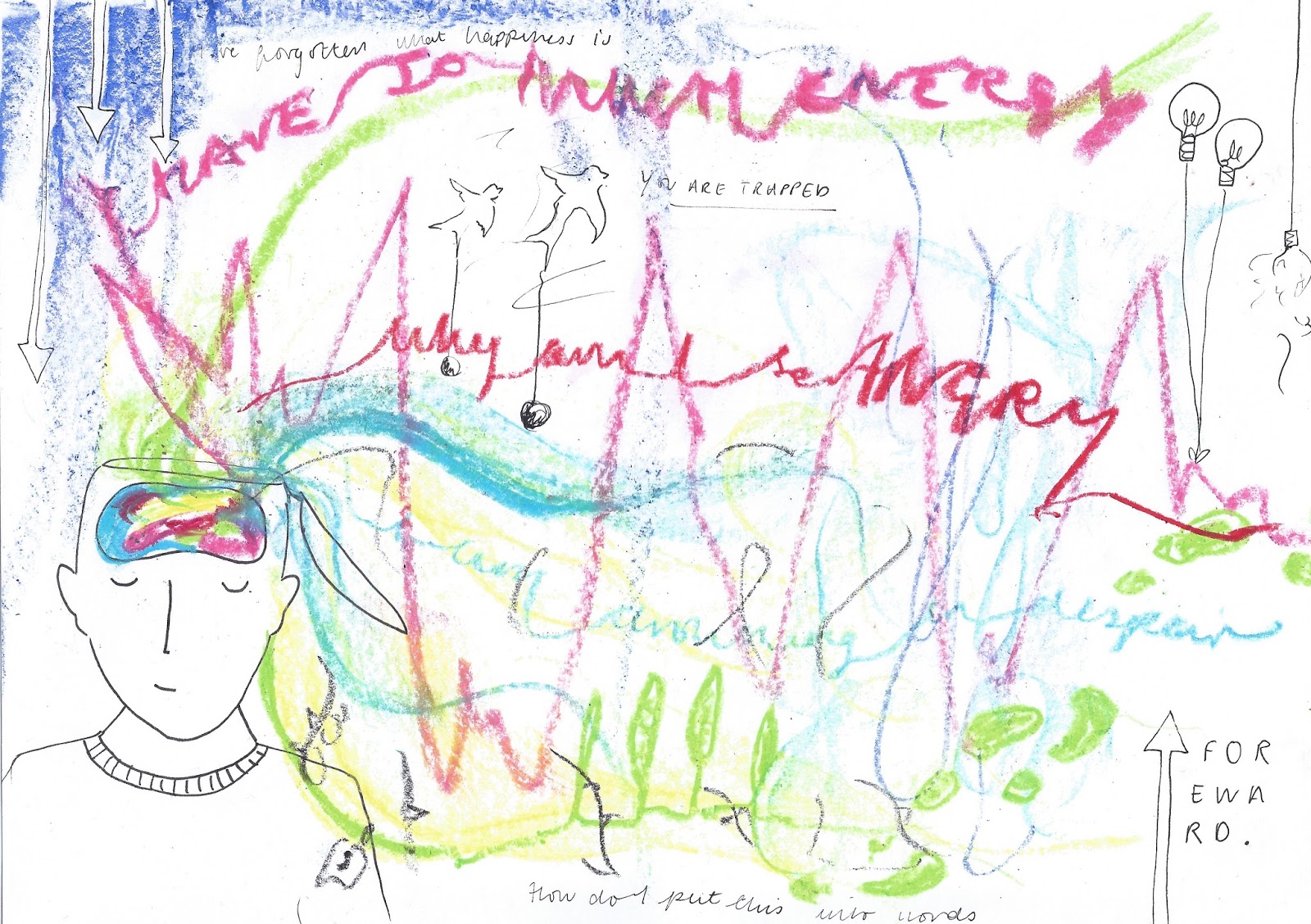
The two things that are stressing me out quite a bit at the minute are PPP and 505. I know a lot of people are in the same boat with 505, having had to prioritise responsive with all of the deadlines being around the same time, but also I feel like I've been going around in circles a bit with it. Luckily in the most recent crit, I gained some really good guidance about where I should take the project. One of my group members suggested that I make a self care pack instead of a workshop pack, which makes a lot more sense and would be a lot less complicated than trying to write a whole workshop plan! Therefore I could focus on the illustrative aspects in more detail rather than worrying about whether what I would be teaching would fit into the curriculum or not.

Having to do a module on creative presence in PPP is so difficult. I have no idea how I want to present myself via business cards and other professional documents, and I always get really flustered when I have to talk about my own practice and what my interests are. It doesn't help either that I've only just got back on my feet from feeling like a zombie for ages, so a lot of my focus has been on helping myself to feel better, therefore I have no idea what I'm really interested in which is SO annoying/frustrating. Although I have to remember that this is only the second year I've been fully focused on illustration, and I am STILL learning, so things don't have to be perfect. The fact that the creative CV, business card etc are documents in progress, means that they can develop as I develop my practice. So I think the best thing for me would be to start fairly simple and gradually build on the content and aesthetic in correlation with my creative practice in general.

Other relevant things to mention

I feel a bit better about COP now (finally!) having had some really helpful essay feedback from Richard and peer reviews about my ~lack of~ practical work. I hands down admit that I haven't prioritised COP as much as I should have, but now that I have clearer sense of direction as to where the project could take me, I feel a lot more enthusiastic and productive about it.

As well, I'm really chuffed at how well our responsive collaborative project went! Rowan, Tom, Amber and I worked really well together on our 'Eden' gender neutral cosmetics project, and the outcomes look really professional. It's been so interesting working with graphic designers and viewing the similar and different ways that they work to us. I do feel really luckily that our group got on so well, and that we worked hard but were laid back and realistic about the work we could produce. It's always pretty difficult to collaborate with other creatives, especially when you have big characters with big ideas in your group, or people that you just don't get on with no matter how hard you try, but as the four of us were really driven, and pretty much on the same wave-length, we succeeded! 


One final thing; I'm actually starting to feel excited about my future career as an illustrator as opposed to absolutely dreading it! The AOI talk was SUCH a huge confidence boost, and eliminated my negative preconceptions about finishing UNI and having to go back and live with my Mum in my depressing home-town and drawing pictures in my tiny box bedroom. Because that might not happen! And if it does, then it isn't the end of the world because you have to start somewhere, and besides, 'you shape your own career'; so knowing that going back home and being trapped in a town swarming with small minded chavs and pregnant teenagers is the last thing I want to do, I will work harder in order to open up more options for myself.

I wrote a blog post about my teaching experiences, but this has also really boosted my confidence; I never thought I'd be able to teach a whole class of six year olds by myself, or even go down to London and take part in a course by myself either. The fact that I'm becoming more confident in myself, saying yes to opportunities that I am given is both reflecting in my both my mindset and my work which is so much of an improvement! As well, I'm not limiting myself as much with things, thinking that I am not good enough with the fear of being rejected. For example, I applied for a summer job teaching art workshops for the national citizens service, but was unsuccessful due to lack of experience with working with vulnerable people. Normally I would have taken this completely to heart and thought that I'd never have the confidence to apply again because I wouldn't want to be rejected for a second time. But I just kind of gave myself a pat on the back for putting myself out there, and that I could try again another time. IT'S NOT THE END OF THE WORLD AND THERE ARE PLENTY MORE OPPORTUNITIES FOR THESE KINDS OF EXPERIENCES.

Upcoming Events/Opportunities/Deadlines


  • I really wanted to take part in the ELCAF and Anorak workshops that are coming up soon, but unfortunately will not be able to attend them! But I will keep thinking and exploring of workshop proposals I could submit in the future so I could try again next year.
  • I'M GOING TO NEW YORK ON FRIDAY!!!!! So going to do lots of drawing, taking pictures and gallery visiting as well as being a cheesy British tourist.
  • 2x designs for Crispin Orthotics brief Deadline 01.04.16
  • Designs for the plus net wall mural following up from the Peter Barber workshop Deadline 10.04.16
  • RESPONSIVE DEADLINE 14.04.16
  • COP DEADLINE 28.04.16

Plan of Action

Due to visiting New York, and also having to go on a training course for a summer job (I got a job on a summer camp wooo!) I actually don't have as much time as I anticipated. However, I'm going to work super hard in the time that I have left for Easter break, and I'm even going to take work with me to America *cries*.

  • Keep being positive, and keep taking opportunities!
  • Work really hard to complete my work to the best of my ability
  • Also think about my individual practice, and building on my own interests again (as they have really suffered in the last few months) for example music and dancing, and I'd like to watch more films e.g. cult films and artistic films as well as reading more books because I feel really un-cultured

Wednesday 23 March 2016

Comix Creatrix: 100 Women Making Comics


Yesterday I went to have a look at the 'Comix Creatrix' exhibition at the House of Illustration. I wasn't really sure what to expect as I don't have a massive knowledge about the comic book industry and sequential art in general, and I kind of feel like you have to sort of be a 'comic book nerd' (not being judgemental-they are cool!) to appreciate comics.
I was excited as well as the exhibition was focused on Women, which made me even more curious. Would the illustration featured focus on feminist themes? Would it just be about women superheroes? (terrible assumption I know)

I also wasn't allowed to take photographs

Things that I learnt that I didn't know/realise previously:

  • Comics go WAY back. A lot of sequential art was inspired by 18th century artist William Hogarth, with his series of eight sequential paintings entitled 'A Rake's Progress'. His work has been described as 'the ancestor to the storyboard'
  • For comics to flourish; artists, writers, inkers, editors were all essential contributors, women were playing parts with all of these roles since the very beginning
Living Histories

  • Very often, the vanished past is bought back into focus through photographs, which don't always help relive the mood
  • Comix Creatrix draws on a wealth of visual/textual resources to help illustrate the 'bigger picture'
  • Todays history is recorded by cartoon journalists, graphic reportage, and political commentators (satire)
  • Infographics and art therapy in the context of comics are proving really effective, and are a strong method of communicating and expressing challenging topics
Personal Matters
  • Self disclosure used to be viewed as impossible within commercial comics as they are a product for escapism, entertainment and larger-than-life characters. Although underground comix turned this around, as well as the breakthrough of themes by artists such as charlotte saloman etc.
  • Hand-rendered writing and making in autobiographical comics created a sense of immediacy and intimacy
  • The reader is in the company of one person revealing their story, so through words and pictures, artists are able to convey shifting, contrasting states of mind and reality
  • Poignant, harrowing memoirs=multiple self portraiture
Top 3 Artists/Pieces

Maria Stoian- 'Take it as a compliment'

All of the books I looked at today were incredibly moving, focusing on challenging/taboo/controversial themes.

Take it as a Compliment by Maria Stoian is a collection of anonymous stories received over tumblr, emails and interviews. Each story is bought to life through Stoians beautiful heart felt and emotive illustrations, which express the complex emotions of people who have been victims of sexual abuse. 

"The stories clearly show that assault of any type is not an honour bestowed on anyone. It is not a compliment". 

This book was a real eye opener. Through the sequential narrative format, it really captured the painfully pressuring and soul-shattering atmosphere created in an abusive situation. The colour scheme and tone of voice that Stoian has chosen to use within her illustrations have a strong, contemporary and slight sense of naivety about them, which really speaks volumes to an audience of young adults and teenagers.

What was most upsetting was the fact of how much, and how easily abuse actually happens, which is so much more than I presumed. Although Take it as a Compliment can make readers more aware of abusive situations, and support and advice that is available to those who need it.

Claudia Dàvila- 'Child Soldier' (written by Michel Chikwanine and Jessica Dee Humphries


Child Soldier tells the story of Michel, a happy five year old boy living in the Democratic Republic of Congo, until he was abducted and forced to become a child soldier for a brutal rebel militia. Luckily, Michel manages to escape and return to his family, but he was never the same again. Michel was encouraged to share his story with others when he emigrated to Canada, in order to raise awareness about child soldiers around the world.

Wow. This book was powerful. I literally had no idea that terrible acts such as these actually happened in the world, it is actually sickening. It made me feel like I take a lot for granted living in the UK, and I will start appreciating things a lot more now. Yes it had that much of an impact on me! The most harrowing part of the book was when Michel was adapting to the Western culture, when he was on a bus and hearing people complaining that 'their phone charger wasn't long enough' and that they 'didn't get their allowance on time', and it was HORRIBLE. (I try not to whine and moan about things that don't matter like that, but people still do everyday and it must create such an awful impression of Western people which makes me really sad)

Similar to Take it as a Compliment, this book is SO important because it raises awareness about the corruptions that take place in this world, and what we can do to support those who are victimised. As well, it teaches us to be grateful and open minded, which is such an important life lesson. I absolutely loved this book so much! The only criticism I would give, is that I would have maybe liked to have seen more hand crafted methods within the illustrations; the digital painting is so beautiful but I feel like the Western technological/digital finish doesn't have the strongest connection with the routes of the book etc.

Katie Green- 'Lighter Than My Shadow'

*Trigger Warning!*

It's hard to believe, but this book was even more emotional than Child Soldier. I picked this whacking great chunky book up from the shelf and realised it was a graphic novel and I was excited because I've never read a graphic novel before! I was expecting to spend about ten minutes flicking through, but I actually spend an hour and a half reading it...

So anyway, Lighter Than My Shadow was written and illustrated by Katie Green whilst she was suffering and recovering from anorexia. It is described as 'A memoir of eating disorders, abuse and recovery' which honestly and emotionally portrays Katie's experience of what it is like to 'trip into the black heart of a taboo illness'. 

I can see a pattern forming of me becoming more and more interested in illustrations that help to raise awareness of subjects and areas that are not commonly known about, ignored or really misunderstood. But I just love books that are focused on people, their experiences and behaviour! 

Anorexia, like most other mental illnesses is often completely misunderstood, which can make it ten times harder for sufferers to cope and get the support they need to recover. I first brushed upon the topic of eating disorders when I was about nine in a Jacqueline Wilson book (of course) when one of the stories mentioned "I got two slices of birthday cake, because an anorexic girl gave me hers". So naturally, I asked my Mum what an 'anorexic girl' was, and she told me that they were "silly girls who don't eat because they want to be skinny". Looking back I am SO cross with my Mum for wording it this way because it made it sound like the illness is a CHOICE when it absolutely is NOT,(my mum isn't a horrible person haha, maybe she just worded it in the best way you can to a nine year old).

But the point is, if more people actually understood how severe and how devastating eating disorders can be, then sufferers would feel so much less alienated, and lead happier and healthier lives. Anyway I am ranting. The real point is, that Katie Green has absolutely astoundingly illustrated all of the aspects and experiences in life, from quite a young age, that can have a devastating affect on a persons relationship with food and the dark depths of despair that it is so easy to fall into. 
As anorexia is a psychiatric illness, sufferers can often experience  really frightening things like hearing voices, hallucinating, having body dysmorphia etc which is absolutely soul destroying, and as well really difficult to understand if you haven't had those experiences before. Green's simplistic and delicate style of illustration portrays this so accurately with the use of fine lines, simple facial expressions enhanced by using lines, and also the symbolic scribble that represents the times that the dark and scary thoughts intrude her mind and stop her from living her life.

I could write a whole essay about how wonderful this graphic novel is. Again to raise awareness of the severity of eating disorders, and how you can support a friend or relative who is suffering, and understand their symptoms would honestly make a world of difference.  Katie Green you are a phenomenal human being!

Evaluation 

I've probably written way too much but this exhibition was so amazing, and I'm so glad I went along. It has taught me how emotive and informative sequential imagery can be as opposed to singular spot illustrations for example, and broken the assumption for me that comic books are not just full of super heroes, and I feel so small minded for saying that. 

Comix Creatrix has really inspired me to have a go at making some comics within my work, and also step away from digital production methods for a while as I have been binging on them a bit recently. Hand craft is so important! And I am kicking myself for neglecting it. At the minute, I'm thinking digital is great for professional works that will be distributed on a wide scale, for example packaging for food products, surface patterns for textiles etc, but analogue is so much more personal, especially in a narrative format.

What I will do in response:

  • I'd like to write to Katie Green and ask her more about her experience in developing such personal topics within her artwork, and also her experience with running workshops
  • TRY DOING SOME COMICS and don't be scared of the whole prospect
  • Follow some of the new illustrators and artists I have discovered today
  • Keep exploring and learning!


Sunday 20 March 2016

BAAT Introduction to Art Therapy

To broaden my knowledge of art within the healing environment, I went down to London for an information day on the profession of Art Therapy at the BAAT (British Association of Art Therapists). I've recently been thinking about becoming an art therapist in later life for a number of reasons, mostly due to my fascination of the human mind and behaviour, and how creative therapies can improve patients recovery.

The day was SO INTERESTING! So much so that I wrote 10 pages of notes about the things that I'd learnt, which I will summarise below. It was lead by Janet and Tobias who are both practicing art therapists, so they were the best people to tell us about the trade. 

(what is a.t.)

Initial Questions

Coming up with questions in groups of aspects of A.T that we wanted to find out about by the end of the day. Some examples were:

  • What are the routes into Art Therapy?
  • Is supervision mandatory?
  • Is it better to do an online course?
  • Is funding available for the MA degree course?
  • Is a medical background required?
  • Does having a mental illness yourself hinder your chances of becoming successful in the profession?
  • How much work experience is recommended?
  • What needs to be included in a portfolio?
Informative response from Janet and Tobias:
  • Art therapy is all about relating, the training mirrors that process
  • It is all about being current, so having an up to date portfolio alongside regular art practice yourself
  • Work experience is absolutely mandatory
  • Work experience in mental health isn't essential BUT it would be really helpful
  • With A.T there isn't a national standard of provision; it is very self-lead
  • CONTACTS ARE IMPORTANT (just like in illustration)
  • You have to undergo therapy yourself when practicing as an art therapist, once a week at the bare minimum (just to keep you sane and to keep a strong relationship going with your own mental state)
  • Do NOT rush your training
  • Training is a journey; the longer you take, the more you learn
My thoughts so far

I got the impression that like with many positions in the caring sector, life experience is mandatory to success. I can relate a lot to my Mum's experience with students; the ones who have had a few years out, gained work experience and have a higher level of maturity are a lot more likely to succeed than 18 year olds that have come straight from A-levels. In other words, at 20 years old I would absolutely NOT be prepared to begin training for A.T.

I found as well that keeping current, making contacts and having a self directed practice is really similar to Illustration. So if I were to go ahead and take up a masters in a few years down the line, I would be confident in familiarising with creative learning processes alongside contact and communication with clients.

Drawing task: what I thought


So this is what I drew in response to the information that was just given to us. I found this so hard because I went into 'Illustration Mode' and my perfectionist habits came into the picture too. But basically I wanted to show how artistic materials can be used as tools to unlock, record and express everything that is whizzing round your head, whether this be good, bad or just really complicated.

More information:

  • The choice of art material reflects on the quality of art making, meaning the action, the doing and the starting point
  • The quality of the art making is personal to us. Our own language, being controlled or not (like a tone of voice)
  • Drawing connects to a phase of our learning as children, how the fantasy is played out, how it is projected and objectified into an image
  • Drawing resolves the inhibiting quality of putting into words
  • Symbolisation - What does something mean? Can you read something in a picture?
  • An artwork is a space between two people, it provides some safety (imagine like a triangle!)
  • Understanding more just by the process of doing
Role of the Therapist/Identifying needs
  • In the last 15 years there has been a great development in neuroscience
  • The importance of the primary carer to an infant is mandatory, and an essential contributing factor to an infants development
  • A baby has no language, it communicates through expression
  • Most clients who partake in therapy are those whose primary carers have upset the early years of development, therefore they struggle to express themselves
  • ART THERAPY GIVES THEM THE WORD TO DESCRIBE THE FEELING
  • At age seven children develop censorship, so they decide whether or not they are 'good' at something. For example 'I'm good/not good at art'. If they are not good they will not continue to do it. It is really difficult to get back into the 'play' frame of mind
  • When experimenting with play, children will discover PUSH, PULL and SWIPE movements, discovering how marks are made
  • With children, a good way to teach them is to create visual games with consequences so that there is a kind of moral/learning aspect to their play
  • It is a good idea to adapt your practice in accordance with the client
  • It is important to emotionally engage with clients too, and manage our own emotions and open them up to the client

Case Studies:

Obviously I cannot disclose too much information here for confidentiality reasons, but I'll briefly outline the things that I learnt.

Child in therapy

Janet told us about her experience in working in a primary school. She had her own room where she lead sessions (it was a clean and safe room) where she had three golden rules:

  • Don't hurt me (therapist)
  • Don't hurt yourself (client)
  • Don't damage the room
The sessions she ran were not strictly structured, allowing the client to fully express themselves in a relaxed and free environment. So basically a 'come in and do what you want' atmosphere. BUT it has to be CLEAR, DEFINED and HEALD.

Breaking the ice can sometimes be difficult. Janet might start by asking the client to 'draw something important to you that I don't know about', that way they can chat and start a relationship.

Therapy can sometimes make behaviour worse in the beginning, similar to counselling, but this improves with time.

There is a close link between narcissism and shame.

Shame-Who we are
Guilt-What we've done
Narcissism-Sense of self

Making a mess is so important! It teaches one to manage their own mess. Which reinforces how mandatory messy play is, physical mess is the best stage without letting it go chaotic.
Mess is important but it can sometimes distract from purpose. There is a limit with materials under the principle of 'once its gone, its gone', which encourages clients to push boundaries.

Most important thing to remember: "You don't have to be a perfect therapist. It denies both you and the client of things that aren't perfect"

Q: How do you relate to clients if  they don't want to open up?
A: Jenga and connect 4 are gems! Also, finding something to engage them for example semi precious stones etc. You could use them as metaphors and ask them, so why did you use that stone? 

~I won't talk about the adult case study because I am worried that I will disclose too much confidential information~

Reflection

Today was extremely interesting and informative and has really fuelled my interest into the topic of art in the healing environment. As I was the youngest in the group, I was advised by Janet to consider going into the profession a few years down the line, which I think is very wise too. Her exact words were, "go travelling, go fall in love and get your heart broken, quit a job you hate and tell the boss to FUCK OFF and just live a little before you start training". 

She was the coolest sixty year old I have ever met.

What I have gained from today:

  • GOOD ADVICE
  • Directions on where to go when I am ready to train, e.g. what kind of experience I need (the broader the better) 
  • Things I can do now e.g. take a counselling course, or a foundation course on art therapy
  • A POTENTIAL STARTING POINT FOR MY DISSERTATION?!?!
  • A greater passion for communicating and healing through illustration
I also got a certificate-yay!


Friday 18 March 2016

Workshop with Peter Barber/ Plusnet Brief

Keeping to my promise to myself to say yes to more things, I thought I'd go along to the Public Art workshop run by mural artist Peter Barber. I was quite excited too because this was basically like an extension of our 'Visuwallise' project for Life's a Pitch!

The manager from Plusnet in Leeds came in to deliver a brief for their company that they wanted to involve LCA students with. They have a really ugly concrete wall in their car park, and would like an exciting and refreshing mural designing to inspire their staff, and just make the surrounding area look more presentable.

In a nutshell, Plusnet is a value broadband provider that adopts a down to earth, friendly Yorkshire charm, and they want this to reflect in the mural. So the brief is really open. Design anything you want, but it has to be cheerful and 'brimming with Yorkshire charm', which makes it super difficult...

I found it really typical to produce some ideas that weren't overly cliche, but I wasn't really feeling creative that day to be honest, so the best I could come up with was a bunch of farmers sitting in a giant Yorkshire pudding (a definite low in my creative thinking history).


The wall and working template

Peter Barber

Peter then gave us a talk about his practice which was really interesting. I made some notes which I'll copy out below:
  • Barber is a full time commercial artist, specialising in painting professional murals in collaboration with advertising companies
  • He did a 1 year NVQ and a 3 year foundation diploma in art and design, where he eventually became an apprentice for his tutor to be taught in detail about the trade first hand
  • He went to uni for a year but decided it wasn't for him
  • With the paint he uses, clients get a LOT for their money
  • 70's and 80's murals are vile
  • Hand craft is appreciated so much more than vinyl
  • Jobs like the plusnet brief we have just been given are his 'bread and butter'
Examples of briefs Barber has worked on:

Client: Don Juliano (tequila brand)
Brief: A backdrop and design for a street food are for a £500k promotional party
Communication: Don Juliano sent a load of images and references of the kind of thing that they liked and leased with Barber until they were happy with the design

Client: Byron Burgers, Gateshead
Brief: Sign writing for their new store
Communication: Sent over PDF files for templates as well as Dulux paint references (very specific)

Other relevant information:

Important: Clients don't always have creative language, so they will present something as close as possible to the real thing

Public tender document: For big projects you have to complete a public tender in order to complete the project. 
  • Design response
  • Interview stage-presentation and value for money etc.
  • The brief history of the building
(they are more interested in whether or not it will work rather than the creative content)

Pouncing: a technique used involving drawing the design 100% to scale with a pencil, piercing holes in it with a pouncing pen, and then chalking on through the holes to work as a stencil. Not many people use it nowadays because tacky vinyl stickers are all the rage.

The deadline for designs is the 10th April, so best get cracking!


Monday 14 March 2016

SB3 Peer Review

Todays peer review was horrible, I'm so stuck about what I want my creative presence to be, and I hate talking about what route I want to go down as an illustrator because I literally have no clue! So the peer review didn't go that well and I just got in such a tizz about the whole thing!

I was feeling pretty grumpy about the peer review, so my housemates and I did a little follow-up exercise. We each had a piece of paper, and we had five minutes to write down qualities about each other and our practice. Here's what they said about me:


Haha they are such charmers!

This was such a confidence boost, although we didn't take it 100% seriously, but it really does make a difference when you hear your personal qualities coming from someone else, rather than painstakingly blowing your own trumpet. 

So I guess I can take forward some of the points that Jack, Georgie and Tom wrote down for me and emphasise them in my creative presence.

Plan of Action

  • Choose maybe five of the things that I think I could play on, that would fit in well with my illustrative practice
  • ~maybe not the fact that I have similar mannerisms to elderly ladies and am 'a bit thick'~
  • I'm also NOT posh!
  • Produce some more rough ideas for next time

Tuesday 8 March 2016

Introduction to SB3: Creative Presence

This module is all about promoting ourselves as Illustrators (exciting yet terrifying)..

Part 1: VISUAL IDENTITY

So this is our professional 'brand' including:

  • Creative CV
  • Letter heads
  • Business cards
  • Website
Part 2: ONLINE PRESENCE

How to promote through online resources and platforms such as:
  • Online blogs
  • Instagram/tumblr
  • Vimeo
  • Issuu 
And also making contacts!

Creative CV Anatomy

A creative CV can be what you want it to be; an infographic, animation or just anything interesting to look at and read. Although it needs to:
  • Be flexible
  • Show your qualities
  • Be unique
  • Only work if it is DIRECTED (e.g. tailored to organisation you're applying to)
It also needs:
  • Standard info e.g. Name, Address, Telephone, Email and Website 
  • Profile: Summary of your character in the third person
  • Qualifications
  • Content Employment/Experience
  • Skills
  • Additional Info
  • References
We all had a go at writing a few bullets to start a framework for our CVs.

Profile:

An outgoing, versatile illustrator with a passion for creating visual solutions to practical problems.

Qualifications:
  • A-Levels in Art, Photography and Business Studies
  • Foundation Diploma in Art and Design
Employment/ Experience:
  • Thought Bubble Festival 2015
  • Colours May Vary 'Off the Page' exhibition February 2016
  • Student ambassador work: Promoting Leeds College of Art, Assisting with Young Creatives' workshops, Visiting schools and giving presentations on the creative industry
Skills:
  • Adobe CC
  • Various printing methods
  • Work well in a team
  • Meet deadlines
OBVIOUSLY THIS NEEDS WORK! And will be continuously changing within the forthcoming months and years.

Further Research

I searched for examples of creative CV's and creative's websites online, and also some social media sites. As well I made a start by setting up a professional instagram and email address, and jotted down a few initial ideas as to what my business cards and other professional documents could look like.


Life's a Pitch: Presentation Feedback


Myself, George, Tom and Amber were so chuffed with our feedback being all good-excellent! I'm really proud of what we have achieved as a group, especially as we are all so different. I guess it shows that differences in taste, interest and area of study can work well if it is approached in the correct way, with an open and positive mind. We have all learnt a range of really valuable skills within 'Life's a Pitch', and feel a step closer to being able to survive after graduating, with the foundations already having been laid out as to what can be achieved in a collaborative business.


Thursday 3 March 2016

AOI Lecture


Yesterday we had a talk from Lou Bones, who is the membership manager at the AOI. 

It was the most inspiring and uplifting talk EVER and it has made me SO EXCITED to become a professional illustrator! (big step for me considering I was absolutely bricking it whenever the words 'after graduation' came up). Lou explained all of the ins and outs, pros and cons of being a freelancer, and informed us of a lot of the dos and don'ts too, which was extremely helpful.

Here are the notes I made in the lecture:

What is the AOI and what does it do?


  • It is a trade association, as illustration is fairly contemporary
  • It helps illustrators in destress with pricing and contract problems, and just the whole business element in general
  • The first point of call is the AOI website, which is easily played out and compatible for all devices
Blog
  • You don't HAVE to do a blog, but if you do it must be updated regularly
  • Try not to be too inspired by current trends, try and create a tone of voice that is your own
  • This is a place to nurture personal projects! Jon Bargeman and Sara Gelfgren do a lot of these
Social Media
  • If you don't use it well, don't do it
  • Twitter is good to follow art directors and create open dialogue, but it has to be professional
  • You shouldn't post sneak peaks unless you have permission
  • Behance is good for project based portfolio work
Self Promotion
  • Physical mailers A5/6 to selected contacts
  • Emails- attach a PDF of 1-3 illustrations no bigger than 1MB
  • Links to social media!
  • Why you want to work for them
  • Write a personal email
  • Follow up with a PDF email a week later
How to get clients
  • The publishing directory
  • Select industry where niche is 
  • Clients that your work is appropriate for
  • Avoid 'Dear sir/madam'
Accounts (bookkeeper)
  • Register their own business
  • Being your own brand
  • Register for income tax
  • Keep up to date accounts
  • Retain all claimable receipts
  • Keep paperwork involved with every job
  • ~cultural expenditure~ claim back, once four times a year
  • YOU NEED A BIG ASS LEVER ARCH FILE
Rights

Copyright: The right to copy
  • Property right that protects ANY work by a 'creator'
  • Lasts for 70 years after creators death
  • Does not require a copyright symbol or registration to exit
  • Independence of physical art work himself
Physical-----Intellectual
  • No copyright in idea/style
  • Copying 'substantial' part of a work infringes copyright. Text of quality not quantity
  • Copying one key image from the work no matter the size could infringe
  • Financially benefiting from reference material= INFRINGING COPYRIGHT- use different references to create your own
Grey areas: Whether/whether or not? = Ask for a reference fee

Copyright Assignment
  • ~rarely advised~
  • BUT, logos aren't applicable
  • It means the client can have it forever and do what they want with it
  • You can't use it in your portfolio because its now the CLIENTS
YOUR COPYRIGHT IS YOUR LIVELIHOOD

Moral Rights

Right of paternity: Right to be identified as the creator of work

Right of Integrity: Right to be identified as not to be subject to change

-Don't apply to newspapers and magazines-

Online
  • Protect your work online so that you can always be identified as the author
  • Low resolution 72DPI: Name as file name
  • Use the Copyright symbol on every page/blog/social media
  • Read terms and conditions of websites/social media
Contracts

Written: Formal
Verbal: Informal (NOT ADVISED)
  • Accept the commission in writing every time, before you start any work
  • This does not need to be drawn up
  • WHO is going to do WHAT by WHEN and for HOW MUCH
  • ALWAYS RECEIVE MONEY FOR A JOB
  • ALWAYS A CONTRACT
  • Terms and conditions- rights as illustrators and cancellation fees
  • Paid in full on delivery of contract
  • You are equals when you sign a contract
  • You have the right to negotiate
Acceptance of Commission

Customer: END USER
Area Cover: Online=Worldwide

All licenses are generally exclusive BUT if you want to sell an illustration to multiple clients then this is not applicable.

Contract essentials:
  • Make an agreement binding
  • Clarity and certainty
  • Demonstrates professionalism and confidence
  • Evidence for any disputes
Look out for:
  • Copyright assignment
  • Moral rights waiver
  • Invocable licenses
Crucial Clauses:
  • Termination
  • Cancellation
  • Rejection
  • Sub-licenses
~If you contract shitty clients its really difficult to get out of~

PRICES:

Examples

Label illustration for a limited edition whiskey, one year: £800-£1000

Quarter page illustration in a glossy mag, single use: £200-250

Advert on bus shelter across the UK for restaurant chain, 6 months: £1,800-£2000

Mural in a design firm reception (2mx2m painted by you): £2000-3000

DO NOT WORK FOR FREE EVER!!!!!!

IT UNDERMINES YOUR WORK AND THE INDUSTRY

~You should not charge ANY less because you are young. Charge for your time and usage time~

Quote accuracy

"We need a ball-park figure" = BAD. Make sure you ask questions.

A lot of design or advertising agencies use these phrases to make you feel insecure. It basically means they don't have enough information to calculate a price.

Non disclosure: Europe? UK? Employees? Usage? OOH=Billboards

EXAMPLE: A mechanic needs to see a car to quote fixing it.

Licensing

  • Separate to selling original artwork, no rights transfer and no license is granted for such transaction.
  • Relicensing gets you more money!

You Need:

  • Client profile - larger clients and budgets
  • Usage - Re-use fee? 60%ish
  • Territory of usage - UK? Europe?
  • Duration of license - three months? or period of copyright?
  • BUDGET - Does client have a a budget in mind? e.g. NIKE HAS A HUGE BUDGET SO YOU WANT THEM TO PAY YOU MORE
NEVER DO DAY RATES

Do not quote without information either.

Client, Usage, Duration, Territory

Advertising

Above the line: Publicity, print, posters, billboards, OOH (out of house), digital

Below the line: Unpaid space; fliers etc

Example: 

Large Snack Company: UK 1 year license all print and digital £6500-7000

Skincare: ww 1 year license social media: £500-550 per illustration


Editorial

Usually fixed in its prices
  • Size of client is based on circulation and size
  • Cover, spread, full page, half page, spot
  • UK generally
Free newspaper - single use UK-£350-400 up to half a page

Consumer mag - print and web £230-250 quarter page

*look at Vic Lee and Lisa Maltby*

Full coverage - more £££

Packaging

It's either:
  • 1 year
  • 3 years
  • 5 years
ALWAYS. 

UK supermarket can only take 5 years of 12 printed packets only, costing £400-450 per illustration (spot)

Large drinks companies? Worldwide £750ish

Publishing

Picture books etc. Either produced through publishers or self-publishing

Cover, spread, full page, half page

Usage: picture book, novelty, children's book, fiction, non-fiction, education

Territory: UK, English language, worldwide

Duration: limited by print run/edition, 10 years period of copyright

Educational doesn't get a lot of money :(

Flat fees- fiction/non fiction, educational= same as product/editorial

Advance and Royalty: children's books, novelty = advantage PLUS royalty

(ask what the plan is)

Author/illustrator: Flat fee £7000 or advance against royalty £5000 plus 10% off RRP.

Buyout- specific time 'license' e.g. UK all media license 1 year or World wide, below the line 3 years

Duration of license:
  • 1 year: £300
  • 2 years: 60-70% of £300
  • 3 years: 2x original fee
  • 5 years: 3x original fee
  • 10 years: 5x original fee


DO IT NOW, HIT THE GROUND RUNNING!

So in summary:
  • Don't work on a day rate
  • Send scary formal letters if clients don't pay you
  • If clients are local, go and meet them!
  • Illustrators work on licenses (ask for lots of moneys)
  • YOU SHAPE YOUR OWN CAREER
  • Go get a website
  • Join the AOI
  • You can also have two jobs! Just need to register as a freelance illustrator