Sunday 29 March 2015

Screen Print Inspiration

Since the most recent visual language screen print task, I have been  more intrigued into the process and inspired to use this method more in my practice.
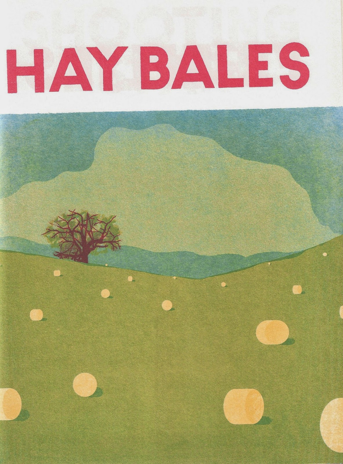
Blex Bolex- Seasons

I took out 'Seasons' by Blex Bolex from the library and was inspired  by the way he used a combination of simple and complex shapes and textures to portray the beauty of each season within a printed book.

I also admire the use of language; one powerful word to summarise the purpose of the image. 


Composition is something else that I really admired in Bolex's work. The use of negative space is extremely powerful, particularly in the piece 'Silence'. Looking at the image, I imagine the scene being so peaceful and quiet.


On the contrary, this piece 'Caterpillar Crawl' is extremely vibrant, clashing and lively, which created a sense of movement and excitement.

I love the way how Bolex is so expressive in his imagery with actions, landscapes, objects, senses and more being compiled to represent the beauty of each season. What I love even more is the fact that 'Seasons' has such a large audience, people of any age can appreciate the well crafted images in this book.


Further Investigation

I did some research on DIY screen printing if I wanted to have a go at it if the facilities weren't available, and I came across a website showing you a simple how-to!


The process is a lot more simplified than having to use all the exposing chemicals in the studio, however it may be difficult to print complex designs with more than one colour etc.

In the upcoming months when I have more time, I'd definitely like to have a go at screen printing my own designs again, challenging myself further in this way of working.


Wednesday 25 March 2015

Tetley Exhibition

Over the weekend I went to have a look at the Tetley gallery, and there was an exhibition presenting all of the artwork that has been used to represent the brand.


I took as many photographs as I could before I read the sign saying NO PHOTOS ALLOWED...


I was interested in how each artist interpreted the task of promoting the brand, but most importantly how they produced work in a variety of different sizes, from A3 to a tiny pin badge, all incorporating the same theme.

This is something I should take on board when producing my work, how will the size of the canvas affect the message that I want to get across?

Tuesday 24 March 2015

David Hockney exhibition at Saltaire Mill

Over the weekend I visited Saltaire Mill and discovered a recent exhibition by artist, David Hockney.

The exhibition was based on the changing scenery of seasons, and I was blown away by the fact that every piece was created by using an iPad! 

I have always admired Hockney's use of composition, particularly depth and leading lines in his scenic imagery, but in this series of work the use of colour stood out to me the most. 
Some of the colours come across as quite abstract and un usual, for example the pink and purple paths amongst the green fields, although I find that in comparison to the other colours in the image, they create a sense of temperature and also the time of day.


For example, my interpretation of these two images in terms of getting a sense of feeling would be that the left image is a late summers evening having brightened up from previous stormy weather. On the right I would imagine a cold, dusk midwinter day where the nights are pulling in earlier by the day.


Hockney's work has inspired me to think more deeply about how I use colour in my practice; how combining certain colours together can create a certain mood, feeling or temperature. As well as experimenting with alternative methods such as using an iPad, something which is considered non-traditional, but which has produced these beautiful images.

Thursday 19 March 2015

Visual Language End of Module Evaluation

1.  Which practical skills and methodologies have you developed within this module and how effectively do you think you are employing them within your own practice?

Visual language has enabled me to become aware of the building blocks within image making, and how to apply them to my own practice. It has allowed me to enhance my basic drawing skills, getting to the route of what every line, shape, colour etc. actually means, and how I intend to get a message across to the viewer. I have had to learnt to produce finished pieces in restricted periods of time, increasing my level of focus as well as being increasingly aware of my intentions of outcomes. Each week that we have learnt something new, I have attempted to apply it to my methods of image making across all modules, with a higher   emphasis on the experimentation and learning element rather than producing a perfect and pristine finished image.


2. Which principles/ theories of image making have you found most valuable during this module and how effectively do you think you are employing these within your own practice?

I have found that the four elements of composition; frame, depth, line of sight and value have been the most valuable in informing my practice. Whenever I try to create images now, I always consider what it is I want to communicate to my audience in terms of the message, importance and significance of each element included in the image.  An example of this would be the way I have tried really hard to create strong, distinctive and recognisable images during the ‘Greetings From…’ brief in the Visual Narratives module. Through planning the content and layout of my images, I was able to inform my audience of which city the postcard was based on purely using visual elements with clear composition.


3. What strengths can you identify within your Visual Language submission you capitalise on these?

Visual Language has been one big learning curve for me; I have focused more on the learning process and how to apply the knowledge I have gained in constructing images, as opposed to focusing on producing an amazing final image that people would immediately purchase and hang on their walls etc. On the other hand, I have often felt deflated with the finished images I have produced as I have the tendancy to compare them to other people’s in my class. My biggest strength has been identifying my weaknesses at the end of each week and setting myself challenges for the next task to improve my outcomes and invest more time into   the explorative and experimental process.

4. What areas for development can you identify within your Visual Language submission and how will you address these in the future?

I definitely have some areas for improvement. In general, I think that I need to be a lot more speculative and embrace each task with greater enthusiasm and drive. Admittedly in earlier tasks during studio brief one, I tended to focus more on my other modules, and neglect visual language, which definitely reflected within my work. In the future, I will plan my time more carefully in investing more time and care into tasks, make better use of the library and take out books related to the specific subject, and research into practitioners further. Just in general, go above and beyond what the brief states.

5. In what way has this module informed how you deconstruct and analyse artwork (whether your own or that of contemporary practitioners)?

Since Visual Language started, I have began to look at images in much greater depth, and almost ‘dissect them’. I have noticed that I have a less ‘passive’ attitude to the subjects in images; rather than thinking ‘that is a pretty picture’, I spend more time analysing WHY I think that picture is pretty. I view each element and ask myself ‘which is the most important?’ which is often dependant on size and colour against the other elements in the picture. Looking further into the composition, line of sight, depth and value become more important too, and towards the end I feel more confident in reading and interpreting what it is the artist is trying to say.
Although this process is fairly new to me, I have started and will continue to use this in my own process of image making by investing more time into planning and producing rough sketches and a list of intentions that I want to achieve.


6.How would you grade yourself on the following areas:
(please indicate using an ‘x’) 

5= excellent, 4 = very good, 3 = good, 2 = average, 1 = poor

1
2
3
4
5
Attendance
x


Punctuality
x


Motivation

x


Commitment

x


Quantity of work produced


x


Quality of work produced


x


Contribution to the group
x


Tuesday 17 March 2015

Position Statement Workshop

Task: Evaluate the ten statements we wrote down; are we a positive or a negative person? 

(I think I see the glass as being half full)

However more than half of my statements addressed the negative things I do.

It is important to address weaknesses as well as capitalise strengths, or it will feel like progress isn't being made at all.

Second Task: Write a list of rules to go with our position statements.

  • I will embrace print workshops with a more positive attitude
  • Go in with an open mind and intention to EXPERIMENT and develop skills, rather than producing a finished piece of work
  • I will keep on top of all of my work
  • Each sunday evening I shall look at google calendar for the week commencing and roughly plan out a schedule. I will make a 'to do list' for each day
  • I will make the effort to keep my mind stimulated and become more aware of things that are happening in the real world
  • Read the news every day, read a section of a book every day and attend an exhibition at least once a month
  • I will eat healthily and exercise to improve my overall wellbeing
  • Do half an hours exercise per day, and don't snack on doritos! (eat five a day)
  • I will invest more time into rough sketches
  • Learn to be patient with rough sketching, spend a lot more time on them.
  • I will draw every day
  • Carry a sketchbook everywhere and look out for things to be inspired by
  • I will diminish my negative self-confidence issue and have more faith in my ability and the work that I produce
  • Every time I am on a downer remind myself that I beat nine other people to get my place. STOP COMPARING MY WORK TO OTHERS.
  • I will make the effort to relax, de-stress and have time to myself so that I don't feel so burnt out 
  • Download a relaxation app/start doing yoga/ listen to more music, and start paying more attention to myself
  • I will make time for my other hobbies so that I don't lose the skills I have
  • Twice a week have time for music to escape the arty world
  • I will try to watch more films and attend more events that will inform my creative practice.
  • Once a week/every other week watch a documentary or an interesting film (not disney!)
  • Become less addicted to social media!!! (seriously hypocritical to my COP project)
  • Resist the urge to check everything as soon as I wake up/before I go to bed. Half an hour per day. This will help me stop comparing myself to others and feeling like I'm not achieving enough.
This task really made me realise that I seriously need to get my shit together. It has helped me identify some issues that I have been pretty oblivious to, and that are preventing me from fulfilling my potential. 

Uni, and this course in particular were always inevitably going to be stressful, but I really need to work on my own stress levels because at the minute they really aren't healthy! This is the most important position statement which needs the most time investing into; if I conquer this then the others should be a lot more manageable. 

Whatever you are, be a good one

I recently bought this book entitled 'Whatever you are, be a good one'. It is filled with beautifully hand-lettered quotes, made by Illustrator Lisa Congdon.


I feel like each quote speaks so much louder by being Illustrated, as opposed to just simply typed out.
The combination of both the language and the aesthetic of each page is really inspiring and uplifting, leading to further speculation of how language can impact the power of illustration.


Congdon has, in a way bought these quotes to life through her illustrations, which is interesting to see how words can be visualised through imagery.

Her work has encouraged me to consider using language within my own work, and has given me an insight into hand-lettering imagery.

Monday 2 March 2015

Position Statement

Following the self-promotion poster task; we then had to make the following list of ten or more things.

10 things I want to get better at:


  • Using photoshop and illustrator
  • Screen Printing
  • MONO PRINTING (because I am terrible at it)
  • Drawing from imagination
  • Having more self-belief and confidence
  • Creating my own work outside of set briefs
  • Finding out what really interests me
  • Balancing four modules equally
  • External knowledge and reference that can inform my practice
  • Better understanding and use of composition and depth
10 things that I want to know more about:

  • Knitting and embroidered techniques
  • The life of freelance illustrators, especially the financial aspect of being self-employed
  • Comics!
  • Politics and understanding of modern conflicts and warfare
  • How films and their directors have an influence on illustration and creative practice in general
  • Printing, because I am terrible at it!
  • Mental health and behaviour; how creative practice can help underpin and relieve problems and suffering
  • Sub-cultures and interesting aspects of cities and popular travel destinations
  • Historical movements that have informed creative practive; e.g. renaissance/modernism etc.
  • Classic literature- I don't read enough books! 

10 places I want to go/people to meet:

  • Auschwitz concentration camp
  • Amsterdam
  • Berlin Wall
  • Barcelona
  • America- Road trip!
  • Africa to help struggling communities
  • Scotland- Edinburgh Fringe Festival
  • Australia
  • Bristol Balloon Festival
  • Japan

10 things I want to change:

  • Having to pay for Adobe CC!
  • The student finance system- it is so unfair.
  • How addicted society is to social media
  • The existence of chavs
  • Violence, conflict and trauma caused by needless reason
  • Peoples attitude and stigma around mental health
  • The dire state of Grantham high street (my hometown)
  • How narcissistic/negative society has become
  • How art students are looked down upon
  • 18 year olds being forced to go to uni, and being seen as a failure if they choose to take another path
Position Statement (combination of the ten most important points from these four lists)

  • I will embrace print workshops with a more positive attitude
  • I will keep on top of all of my work
  • I will make the effort to keep my mind stimulated and become more aware of things that are happening in the real world
  • I will eat healthily and exercise to improve my overall wellbeing
  • I will invest more time into rough sketches
  • I will draw every day
  • I will diminish my negative self-confidence issue and have more faith in my ability and the work that I produce
  • I will make the effort to relax, de-stress and have time to myself so that I don't feel so burnt out 
  • I will make time for my other hobbies (music) so that I don't lose the skills I have
  • I will try to watch more films and attend more events that will inform my creative practice.

Self-Promotion

Self-promotion is 'the action of promoting or publicising oneself or ones activities, especially in a forceful way.'

Many creatives, especially freelancers have to maintain a high level of self-promotion in order to gain clients and allow themselves to become well known in the industry.

Task: Produce a promotional poster with a portrait.

I started my research by tapping 'self promotion' and 'self-promotional poster' into pinterest and gaining some interesting results.


Above are many of what would be considered to be unique and interesting ways to draw customer attention and interest.

A number of other key methods of business (freelancer) and client communication and overall success include:

  • Being confident in the business manifesto, i.e. the illustrators qualities and services
  • Knowing own strengths and accomplishments 
  • Having a USP (unique selling point), although this may be difficult as a freelancer as many illustrators have similar intentions and ambitions
  • Developing good client relationships and contacts
  • Be motivated, be passionate about work and do it well
  • Be patient and determined but also push boundaries
  • Use of persuasive and demanding language
http://www.coachingforchange.com/pub06.html

All of the above points must be shown in the method of promotion; in this instance a poster. The idea is for a client to choose YOU over any other illustrator.

Some promotional posters:


My Ideas


I devised a quick character that represented me in a simplified way incorporating my height, the way I usually wear my hair and my favourite pair of shoes that I wear most days.

The finished poster


Admittedly I did rush this whole process; I definitely should have invested more time into the planning and crafting of the poster. I could have incorporated more humour into the language, emphasised particular features e.g. my height (taking the piss of how short I am) and also invested more time into the presentation of type.

Task

As a group we had to award first second and third place to the best posters, and state why. I received two third places for the concept, being 'cute' and simple and straight to the point.

In the group there were posters that were extremely humorous, informative and all round effective in terms of communication with the viewer. It is important to realise that we need to imagine that the audience for these posters aren't just our classmates; we need to imagine that these would actually determine whether or not a client would choose to employ us based on the information and presentation given in the poster.