Wednesday 28 October 2015

Fashion Tailoring Workshop

As part of my student ambassador role, I have branched out into working on the progressions side as well as the marketing side of things (open days etc.) Today I had my first progressions shift where my role was to accompany and instruct 15-18 year olds on a fashion tailoring workshop. This was a great opportunity to learn new skills myself; for example today I learnt how to hand-sew a button hole and how to pad-stitch the inside of a jacket lapel, and to share these skills with others.

As part of my practice in the future, I am considering teaching as a potential option, and engaging in workshops like these on a regular basis to improve my confidence and teaching skills.


Tuesday 27 October 2015

Reflective Practice and Professional Contexts

What illustration means:

Drawing- a process of exploration, a tool used to record visually

Image making- Visual language, shape, form, colour, line, organising visual information

Illustration- Communication, problem solving, responding to a brief

We asked a lot of questions today:


  • Who makes the rules to do with illustration?
  • Do we have to stick to them, who says?
  • Can other people (clients) define our practice and what we do?
  • Can you be commercial and ethical at the same time?
  • What happens if you can't get work?
  • What happens if you get stuck in a rut?

Hopefully second year will provide the answers to some of these...


First Task

Define products, contexts and functions of illustration


Second Task

In groups we chose three categories from the following, and make the same lists of products,contexts and functions: 

  • Character and Narrative
  • Editorial and Reportage
  • Product and Packaging
  • Object and Environment
  • Publishing and Book design
  • Retail and Merchandise 


Third Task

Identify 5 examples of Illustration within the 3 categories:


Character and Narrative

Business-related character 

Could be used to visually assist a publication such as a leaflet, or presentation to break it up a little and make it less black and white and more exciting.


 Finn and Jake- Adventure Time

Created for a children's/young adult/ all ages animated television programme. Two fictional characters living in a post apocalyptical land having a different adventure each episode.


'Change for life' characters

This series of simplistic colourful figures were designed to help advertise and promote healthy lifestyles mainly to young people, but can apply to all ages in a society where obesity is a major crisis. They appear in leaflets, television commercials, billboards and more displaying and communicating ways in which to engage in activity, exercise as well as eating the right things.


M&M characters

The M&M characters are used to advertise the sugar coated sweets that have almost taken over the world... They appear on M&M packets, on TV advertising and more recently as merchandise in the M&M world stores. In the commercials the characters are usually contained in a 30 second short of day-to-day every life situations, interacting and joking with humans. If people like these characters and think that they are funny, this will increase interest, popularity and sale of M&M's.

Microsoft word assistant

A notorious character on the old windows 2000, designed to assist with any queries when using the programme. Occasionally popping up with little prompts, communicating directly with the user to make sure that they had the best possible experience with using it.

Editorial and Reportage


Editorial


Adam Quest - (untitled) 
An editorial piece using an iPad as a visual metaphor for a blood transfusion; something which is essential to live. Is Facebook essential to live? It seems so in this day and age.


Andrea Wann - (image as part of a series about parenting teenagers)
Another editorial illustration communicating the changes and distant feeling when your children grow older and are no longer fully dependant on parental care, how that can make a parent feel.


John Holcroft - 'you are what you eat'

Illustration showing the fast food epidemic and how it is affecting the health of our society. How by eating unhealthy junk food can make you look and feel terrible.

Reportage (more about recording your surroundings)
Lizzy Stewart

Visual recording of food she ate in a particular day during a trip away; this informs the viewer about changes in culture and experience in general. 


Veronica Lawlor

Another line and colour based sketch of times square in New York. It captures the busy feel and excitement of the hustle and bustle of the city.


Product and Packaging
 Carolyn Gavin

Packaging for a Swedish brand of organic chocolate. Could this be aimed at women? The colour scheme and use of flowers are very stereotypically feminine; I couldn't imagine a man buying these.


Lacy Kuhn

Packaging for a new affluent yet fun cereal with the clever use of character and narrative combined in the imagery.


Mady Woodin

Colourful and intricate packaging for a range of Tesco's own brand soup.
 Laura Gee

Illustrated phone case, a niche product for people who empathise with cats...


Sarah Thorne

Packaging for Topshop's makeup brand.


Sunday 18 October 2015

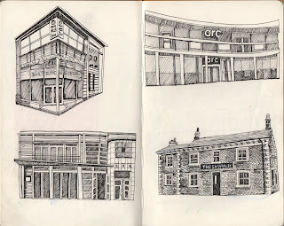
Zine Progress

My progress so far on the zine for Thought Bubble:


 9/19 drawings complete


So I have 20 Days left to finish and print the final zines (in between all other modules)

Struggles so far:

  • Putting this project on the back burner as I have had such a long deadline; I don't want this to effect the quality of the final outcome.
  • Attempting to make each image distinctive and relate to each other in terms of tone of voice. I have noticed that my drawing skills have in some ways improved as I have progressed in each image; but I may not have the time to go back and refine my earlier images
Productivity Plan:
  • Aim to draw two pubs/bars per day
  • When completed, spend some time (maybe dedicate a whole evening) to cleaning up and refining each image in photoshop; for example making some of the lettering clearer etc.
  • Spend an evening designing the front and back covers and put together on indesign; take draft copy to group crit to get feedback before printing final copies
  • If there is time; think about creating a special edition of the zine! 'The activity edition' (taking along the book on the Otley Run and scoring points)

Tuesday 13 October 2015

Bigheads: Kyle T Webster


  • Kyle Webster grew up all over the world because his parents were travelling teachers, so from a young age he was very cultured, living in places such as Pakistan, Singapore, Taiwan etc.
  • His earliest memory of anything art-related was a Star Wars colouring book that he received back in the 70's.
  • He has a background in graphic design work, but has been focusing on illustration since around 2003.
  • HE IS VERY ADAPTABLE AND HAS A CERTAIN DRAWING CONFIDENCE, almost like the idea of having an alter-ego


  • He is NOT a metaphor guy
  • Custom brushes are his thing, he has over 120,000 custom brush customers!
  • Although custom brushes are a digital tool, Webster stresses the importance of hand rendered techniques, stating that his brushes won't be good to anyone who doesn't know what the natural media feels like


  • His advice with digital processes would be that the best results are produced by drawing with a large cintiq, as drawing must use the WHOLE ARM.
  • Great illustration goes beyond the page
  • His advice to uni students would be to pay attention to colour theory, as this is an integral part of an illustrators tool kit, and also gaining an understanding of contracts, rights and fair fees, as he feels as if he was taken advantage of.
Reflection

I was SO impressed by Kyle Webster, he came across as being such a hard working and genuine person who had such a respectful mannerism in relation to the illustrative trade. His relationship between analogue and digital processes is very well balanced, as he is highly aware of each of their values, and how they can be used in the best possible ways.
The one thing that I admire about Webster's work is his versatility.  To work in such a broad number of ways is something that isn't very common with professional illustrators, as they often want their style/tone of voice to be distinctive, therefore sticking to only a limited number of image making methods within their practice. I can see two sides of the argument here, having recognisable work is great for personal development and building a good client base, yet the ability to show a broader range of skills somehow speaks to me more. I feel having a versatile ability broadens your horizon in the way that you communicate with your audience, and that is not always possible and as effective with such restrictive ways of working.

As I am a keen experimenter, and haven't yet developed my own 'tone of voice' or specific 'style' in my work, the success of Webster massively reassures me, and has inspired me to keep trying out new ways to communicate and develop as a multi-skilled image maker.

Thursday 8 October 2015

The Guardian Brief

At a bit of a last minute decision, I decided to tackle the Guardian brief, a) because it is a fantastic opportunity to have a shot at winning and having my work feature in their newspaper and on the college website and b) I wanted to stick to my word of saying yes to everything and pushing myself further this year.

The brief was to produce three illustrations under the umbrella of; graduate jobs in the arts industry, pursuing analogue techniques in a digital era and producing the perfect portfolio.

Rough Sketches

As I was rushed for time, I didn't produce a vast amount of rough sketches, and mostly pushed on with my best ideas.


Graduate jobs in the arts industry


Here I have shown the stereotypical cap throw of a graduation ceremony. To me, the symbol of the cap represents success, relief and the opening of a new gateway to the graduate stage of life, with these gradually turning into symbolic artistic materials, showing that progression of going upwards into the real working world of the creative industry.


Analogue/digital techniques


This image was mostly inspired by the 'made you look' documentary I went to see last week, emphasising the beauty and originality of analogue techniques in todays predominantly digital era. The second image shows the analogue process of screen printing, and the screen sort of ironically revealing digital processes.

Building a perfect portfolio


This was the hardest image to produce without it being overly literal. I have shown a lot of skills that  Leeds College of Art provide you with during the time of study, all around the symbol of the a1 portfolio. These include analogue and digital skills, opportunities and goals to aim high and achieve, ideas and innovative ways of thinking, and time management and efficiency skills.

The final images

To say that I decided to tackle the brief at a fairly late stage, I am really pleased with the outcome of the images. I used Illustrator to produce the images because I felt that it was my strongest skill last year, although I do hope to enhance my analogue skills further in the future.


Monday 5 October 2015

Who am I? Why am I here?

5 things I have learnt so far on the programme

  • ILLUSTRATION IS NOT JUST DRAWING, it is so much more complicated and interesting than 'just drawing'
  • How to solve a problem using an illustrative solution
  • How to professionally arrange, and bind a book
  • What vectors are and how to use them
  • How to screen print
5 things I want to know more about
  • Digital techniques (i.e. how to paint on photoshop without it looking pixelated)
  • Life after college, how to sustain motivation and interest
  • What direction I would like to see my work going in
  • How to breach into the professional world of illustration (how to manage all of the adult things that come with it e.g. taxes, copyright)
  • My own illustrative voice, I need to be more adamant and confident in order to know how I work and what I want to achieve
5 things that I think are my strengths
  • Organisation
  • Time management
  • Determination/enthusiasm
  • Awareness of where I am in terms of progress within my practice
  • Using strong themes and symbols within my work
5 things that I would like to improve
  • My obsessive level of dutifulness
  • Exploration methods using new/different materials and processes (being less uptight about neatness and staying in comfort zone)
  • My confidence in using digital programmes, photoshop in particular
  • Pushing myself more in all areas, rising up to every challenge and taking all opportunities
  • Awareness of external topics and how I can develop an interest in these further by drawing
5 practitioners that demonstrate my interest in illustration
  • Jessica Hogarth- an LCA graduate working in Whitby, a lot of her work is based around the theme of seaside towns and buildings, which I really admire
  • Owen Davey- ever since bigheads he has inspired me. The tone of voice of his work is very colourful and playful, as well as being adaptable to working with children's books to editorial pieces
  • Gemma Correll- Generic, yes but I am interested in the transition of how simple ideas and humour can take the market by storm, and sell to huge companies like UO, ohh deer etc
  • Michael Driver- I love Driver's illustrative relationship with people;his tone of voice is extremely playful and he captures character, action and purpose extremely well.
  • Hattie Stewart- I admire her guts and courage. She is very bold and headstrong and this comes across in her weird and wonderful work
5 websites/online resources that demonstrate my areas of interest within the creative industries
  • Instagram (sorry!)
  • ohhdeer.com
  • Handsome frank
  • Creative safari
  • AOI

Friday 2 October 2015

Made You Look- Hyde Park Picture House

Yesterday I went to go and see the showing of 'Made You Look', directed by Anthony Peters at the Hyde Park Picture House.

It was a documentary about the UK DIY Graphic scene in the 21st Century, particularly about the influence of the digital age on supposedly what is seen to be a traditional hand rendered based trade. It featured interviews with well-known Graphic Artists and Illustrators such as Hattie Stewart, Jon Burgerman, Helen Musselwhite and more, whom all answered questions such touching on the topics of what inspired their creativity/what was their first piece of artwork that they remember, their opinions on the internet and how they feel the digital age has influenced their practice.

For me it really enforced the beauty and originality of work produced with no digital aid, and how these things should really be appreciated and more highly valued because they are unique and not just a 'copy'. When I say copy, I mean that it can be so easy to slip into the habit of solely using digital methods to produce work, that it could be easy to find it difficult to differentiate between different practitioners tone of voice.

Another important point within the documentary was whether each practitioner thought the internet was a good or bad thing in terms of productivity and opportunity. The good points existed in terms of how easy communication and networking has become, and the opportunities that they can provide. However there were many bad points, including distraction of social media, mainstreaming of websites (how do you differentiate from another illustrator?) and most importantly self doubt combined with comparison of other practitioners, something I very easily fall into the trap of. 

In conclusion, Made You Look shares an extremely important message to all creatives emphasising the value of stripping back and making artwork from a non-distracted/pressurised mindset with analog methods, and how refreshing it can be to make things inspired by the real world.