HOLIDAY!!
One thing I always begrudge my parents for is not taking me to Disneyland as a child, so at the age of 19 I decided that I would bite the bullet and go myself, and explore the beautiful city of Paris at the same time.
Whilst I was there, the weather was a little unbearable for me at 41 degrees, so keeping hydrated and staying cool was my main priority, I still managed to do a drawing every day (a lot of the time in ride queues) but I hope to work from my photographs that I have taken too.
Illustration was used in so many ways around the park; whether this be the attractions themselves, menus, posters advertising different areas and in particular the light show projected onto the castle every evening where the animations had to be customised and designed to specific dimensions to display accurately and effectively onto the castle.
(I really,really admired the minimal cool colour pallet in this poster with the contrast of the warm shades of orange of green, it works so well)
(I know 'Its a small world' is a children's ride but the colours and lighting used in each scene were so vivid. The whole thing was extremely well designed, maybe apart from the extremely annoying catchy tune...)
In some ways, I am glad I visited Disneyland at an older age because I could appreciate the fantastic attention to detail that went into making the whole place look so polished to the highest possible standard, that contributes to it being such huge attraction. It's so strange to think that Walt Disney could create such a legacy within his work that has inspired these theme parks to be built on a transnational scale, all from starting out as an illustrator who aspired to achieve big things.
My favourite part of the park was the animation building in the Walt Disney Studios park.
Traditional methods of animation used before digital technology:
AMAZING CONCEPT ART!!
I love seeing how other illustrators/artists interpret and visualise the stories before they are constructed in the tradition 'Disney' tone of voice. Admittedly I have thought a lot of scenes are just 'typically Disney' for example the generic enchanted forest and princes castles etc. Seeing the initial stages of planning and development really fascinate me in how one final design can be acclimated through many creatives different ideas of how they feel a particular scene should look.
This was the same with characters. I didn't realise but many creatives actually build models of the characters they are designing before they sketch them out to get a real physical feel of their presence.
The creation of the Beast character from beauty and the beast was really interesting as his final form was combined from parts of different animals, different parts for different reasons; for example 'the grandeur of a buffalo, strength and intelligence of a buffalo,boar tusks to convey danger, cow ears to make him look less frightening, a lions mane for courage and fox legs to give him a odd unbalanced animal quality'.
I had a go at making a zoetrope strip too!
The whole animation section was so interesting. It has always been a bit of a cliche 'illustrators dream job' to work on these kinds of things, but actually seeing the progression from initial sketches to seeing the films themselves and the artists input has really given me an insight into almost the reality of how creative people are valued in the animation and film industry.
Visiting Paris
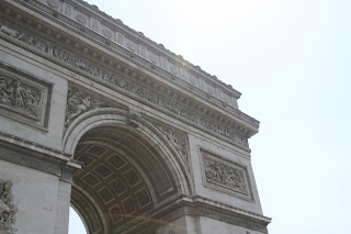
So the initial idea was to spend half the week exploring Paris and half in Disneyland, but due to the unbearable weather and having a terrible sense of direction resulting in getting lost numerous time, I had to cram everything Parisian into one day!
My sketchbook looks pretty poor from the day but it was so difficult to find a place to work accurately in the heat, amongst the hustle and bustle and simultaneously produce decent drawings.
However from my experiences of exploring Paris and taking in the culture, I have a list of things that I want to further explore through drawing and making from it:
- Tourist culture
- Parisian buildings
- French cuisine
- How illustration/other aspects of design can promote and inform tourists


No comments:
Post a Comment